Designing a Seamless Experience for an E-Learning App Dedicated to Building Information Modeling (BIM)
Project Overview
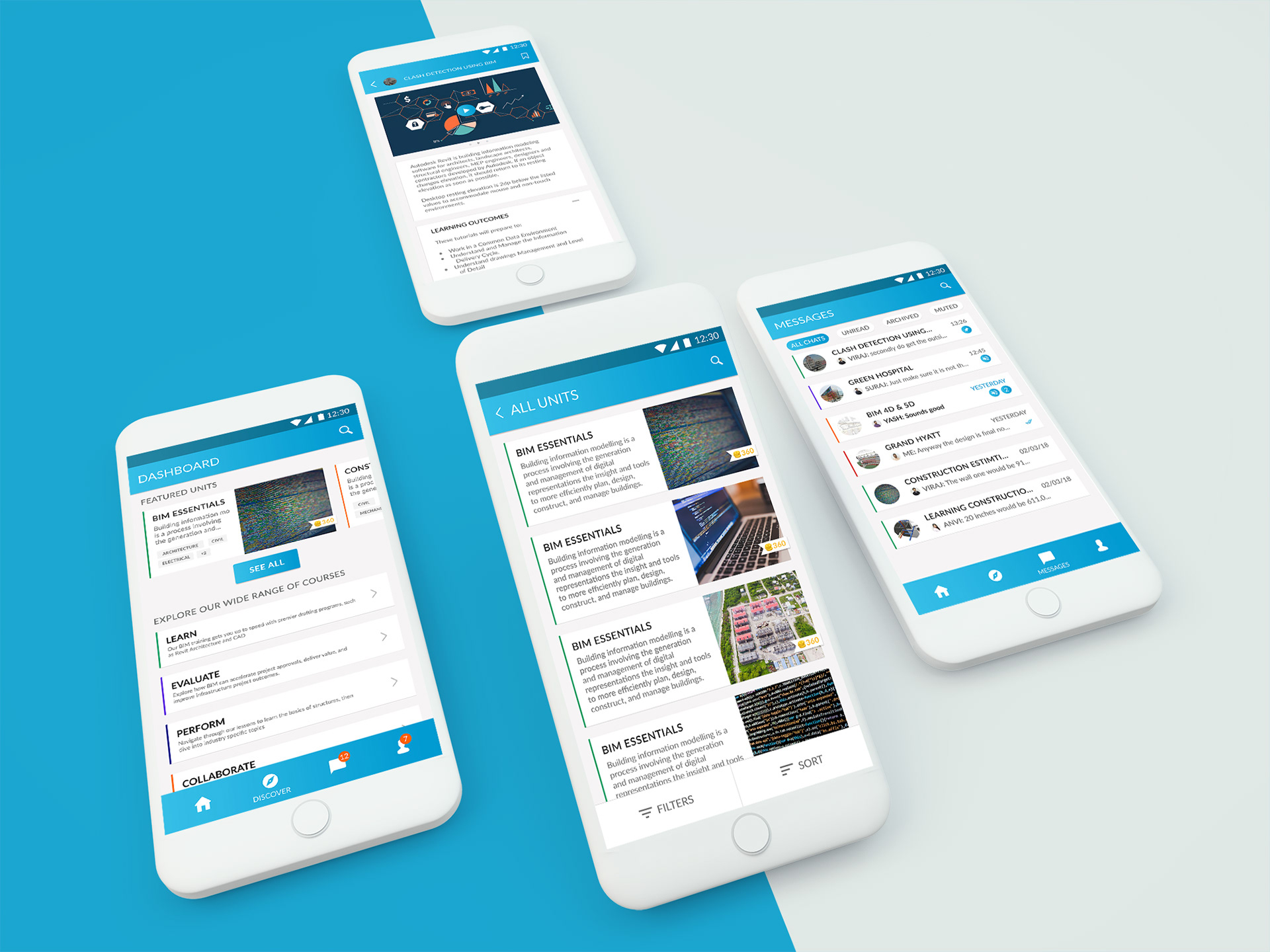
I led the end-to-end design of an e-learning platform aimed at equipping Architecture, Mechanical, Electrical, and Plumbing (A-MEP) students and early-career professionals with the skills required to work with Building Information Modeling (BIM) a technology that was rapidly becoming essential in the industry.
The platform was envisioned as both a mobile and web-based learning environment that would provide accessible, structured, and practical training in BIM and related tools. The primary challenge was to design a user experience that felt intuitive for learners transitioning from traditional academic settings to a more dynamic, self-paced digital environment.
MY ROLE
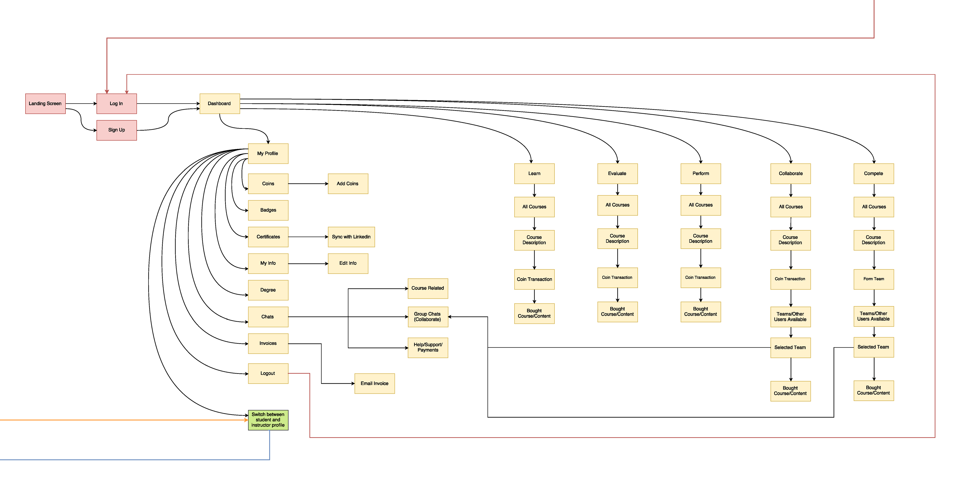
As the Design Lead for this project, I was responsible for developing the platform’s core information architecture, user experience, and interface design. I began by mapping out the full system architecture in Draw.io, laying the groundwork for navigation, feature grouping, and content hierarchy.
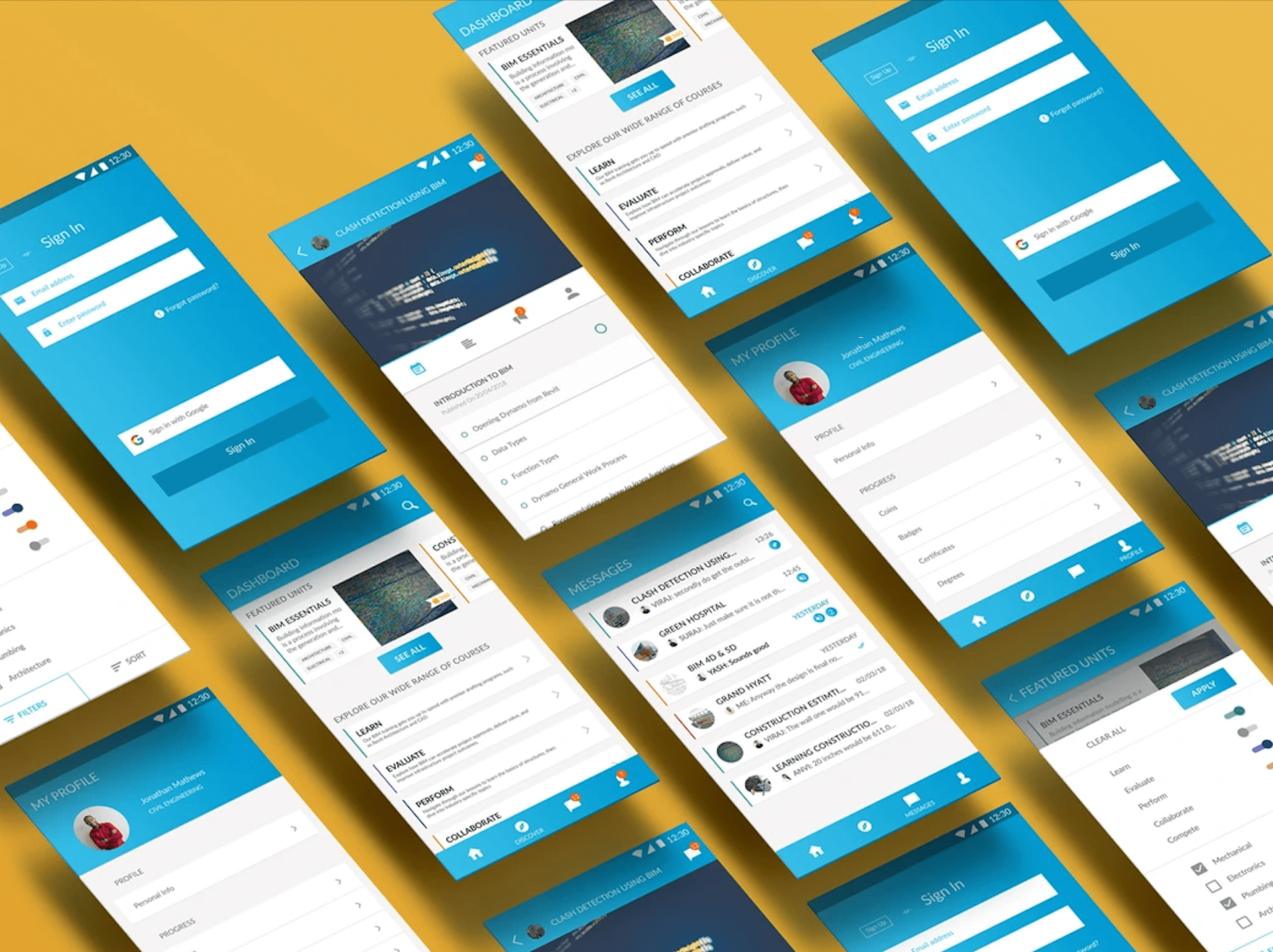
With this foundation in place, I sketched out multiple UX concepts, focusing on streamlining task flows and reducing friction across key learner journeys, from course discovery to lesson completion. These sketches evolved through several iterations, ultimately resulting in over 100 high-fidelity mockups created in Adobe Photoshop. These designs were then prototyped using InVision to enable feedback loops with collaborators and stakeholders. The final product is currently under development using Flutter for cross-platform deployment on Android and iOS.
Understanding the User
Although this project did not begin with a structured user research or a competitive analysis, we leaned heavily on our existing knowledge of the domain and informal input from students and instructors within the A-MEP ecosystem.
Our learners were navigating a paradigm shift from highly theoretical, classroom-based instruction to practice-oriented, software-driven learning. Many were new to digital platforms but were eager to build industry-relevant skills and stay competitive in their fields.
By basing our approach in these observations and conversations, we were able to shape a design strategy that prioritized ease of access, clear progression, and a sense of support throughout the learning journey. This foundational understanding of our users played a key role in the creation of learner personas and informed all major UX decisions that followed.
Key Takeaway From Market Survey
Learners were transitioning from passive, theory-heavy education models to active, skill-based digital learning but lacked familiarity with digital platforms.
This revealed a dual need: designing for accessibility and ease for digital newcomers, while also creating structured, industry-relevant learning pathways that could instill confidence and foster continuous engagement.
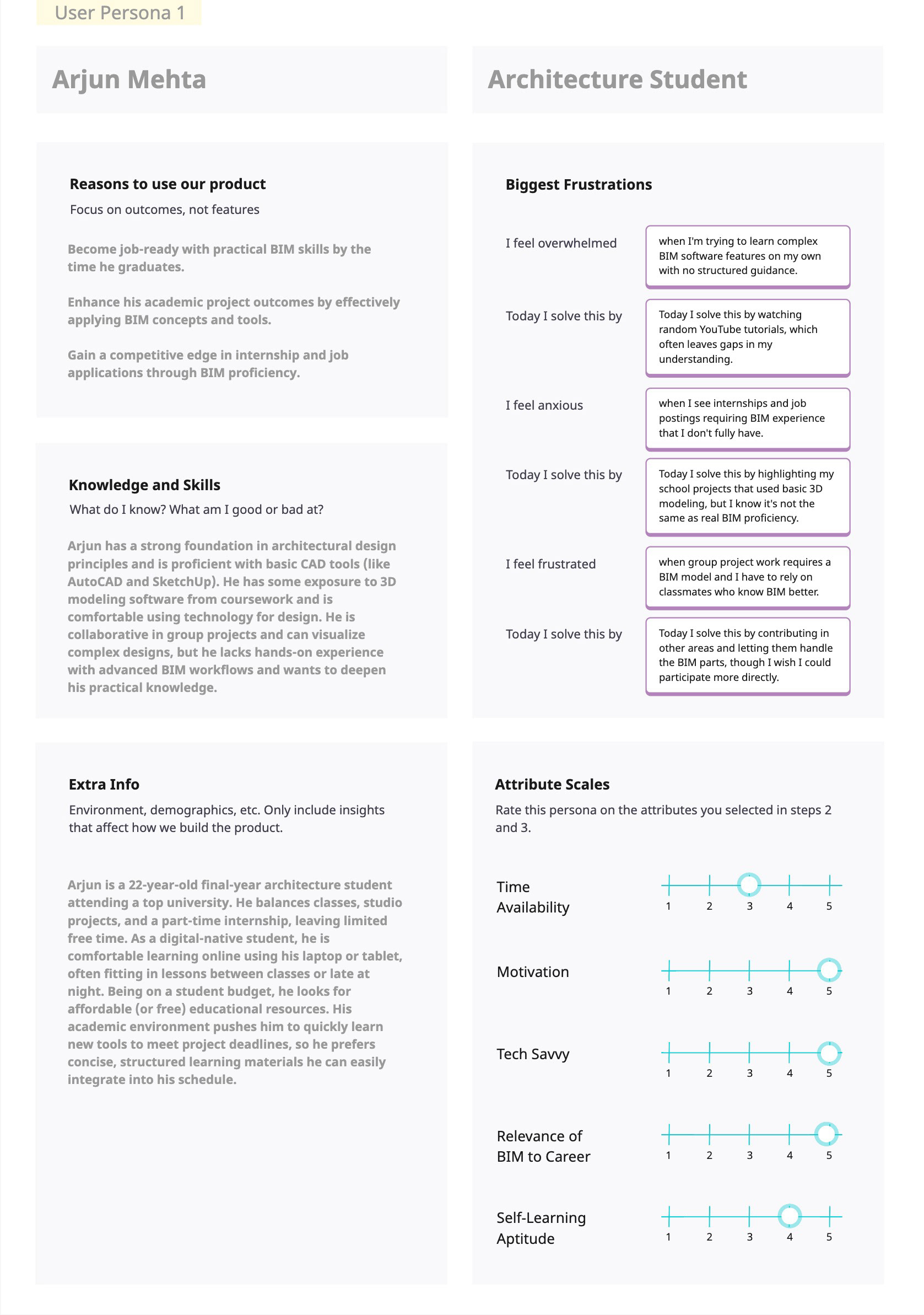
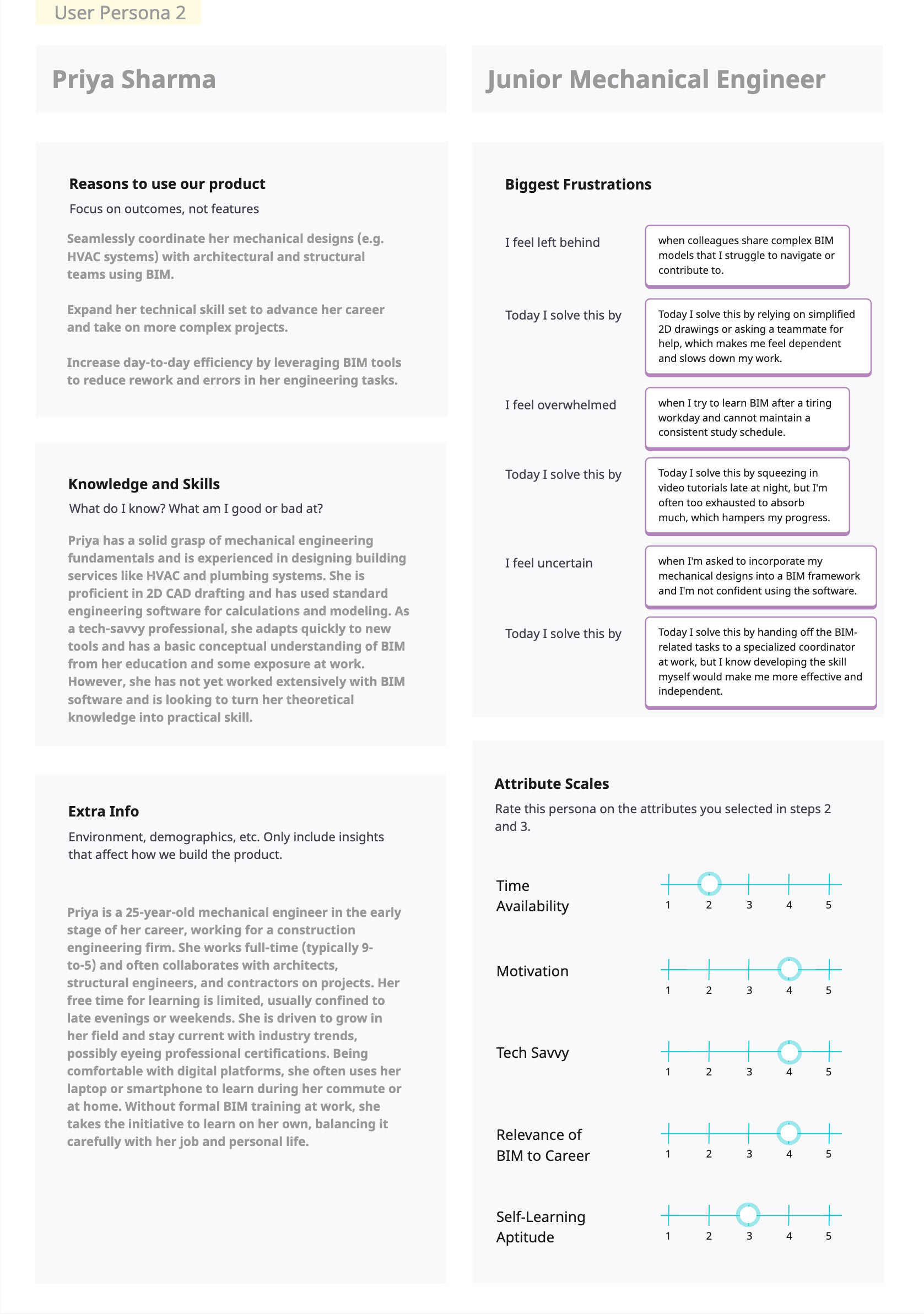
User Personas
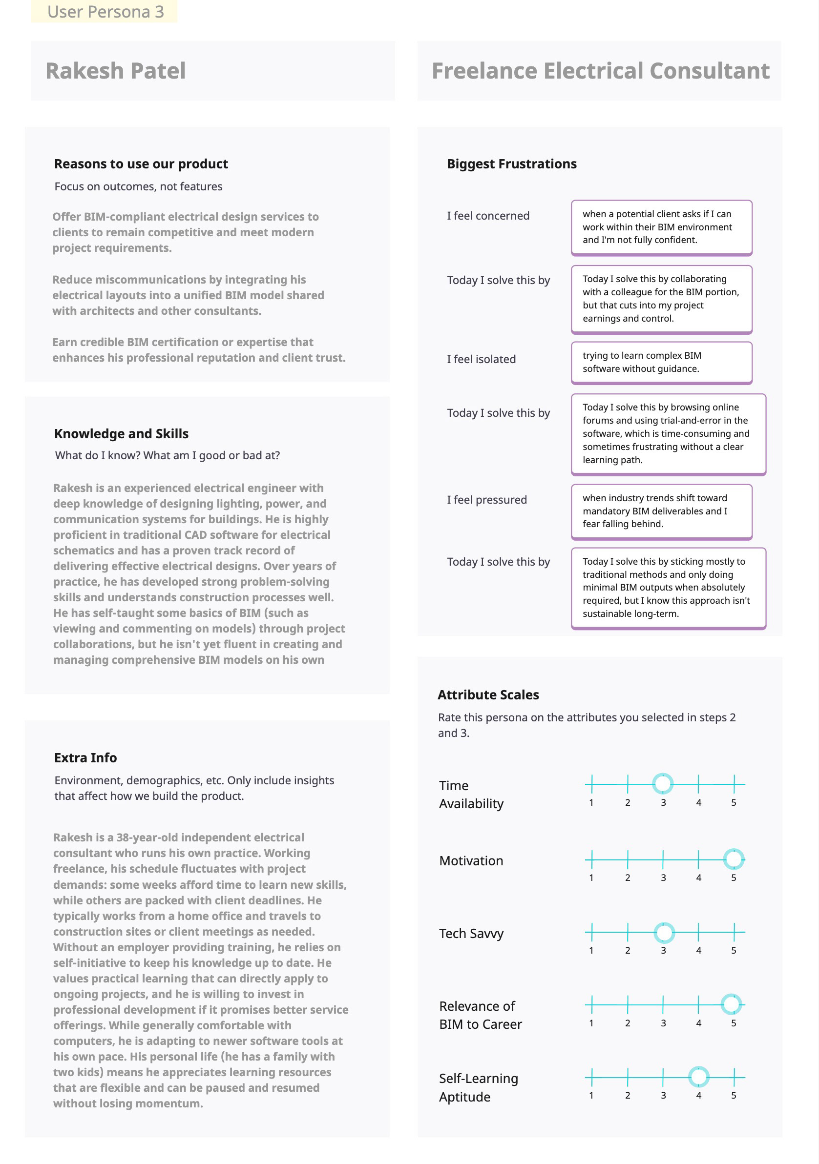
I created three distinct personas; Arjun, an architecture student; Priya, a junior mechanical engineer; and Rakesh, a freelance electrical consultant, to ensure the e-learning app design considered real-world diversity in users' needs and experiences. These personas emerged from informal conversations and my understanding of learners across different stages of their careers, helping me stay grounded in actual user motivations and challenges. Rather than designing for a generic user, these three stories provided clarity and empathy, enabling thoughtful, user-focused design decisions throughout the project development.
User Journey
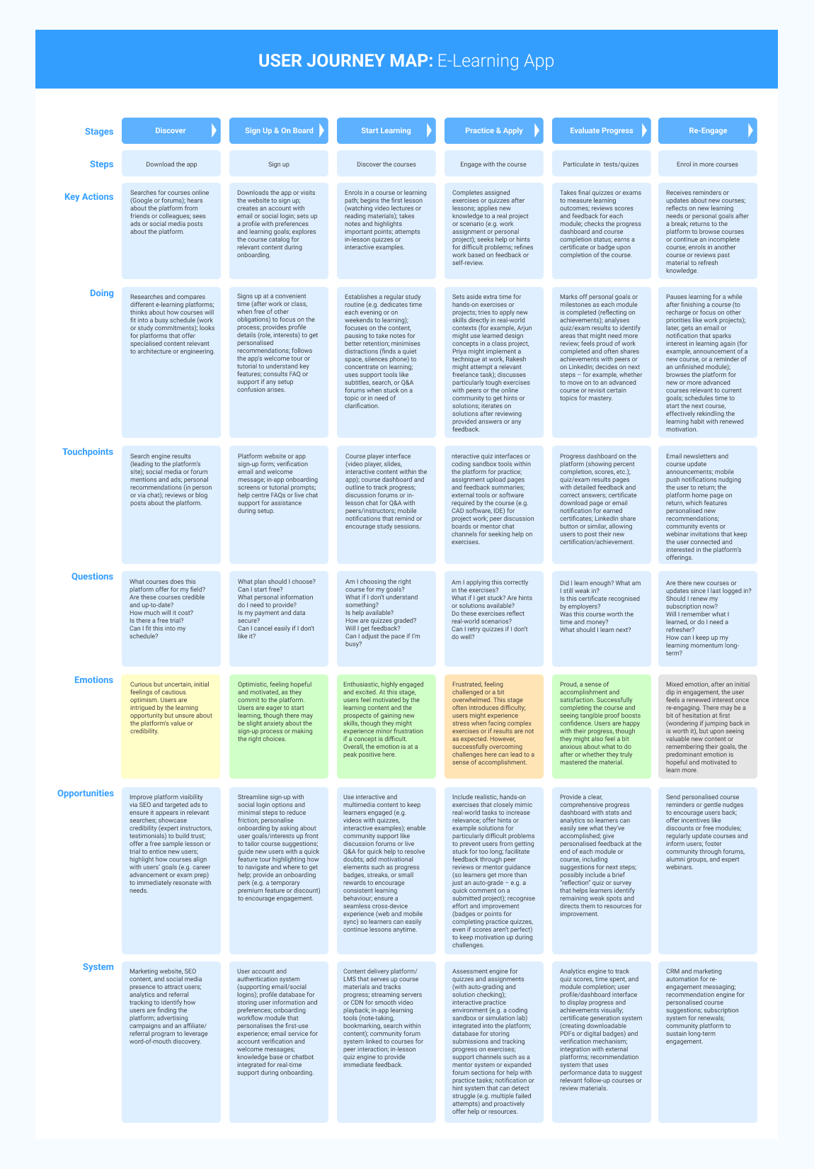
I created the user journey map to visualize how Arjun, Priya, and Rakesh would realistically interact with the e-learning platform. From their initial discovery and onboarding to practicing skills and re-engaging after course completion. Mapping their journeys helped me pinpoint critical moments where user needs could be better met, frustrations could be reduced, and overall engagement improved. This clear, step-by-step narrative provided a practical framework, guiding my design decisions to create smoother transitions, more meaningful interactions, and ultimately, a richer learning experience for all three personas.
Key Learnings from User Journey Map
Comprehending User Downfalls and Successes
While mapping out the journeys of Arjun, Priya, and Rakesh, critical user empowerment and overwhelming user experience moments stood out. The initial stages of discovery and onboarding were driven by interest and excitement, but the practice and application phase revealed the most emotionally low dip. This illustrates how quickly a learner’s confidence can wane when transitioning from content consumption to practical real-world application.
Personalization and Support as Constant Elements
The journey further unveiled that at almost all stages, users had some form of questions and doubts, merely in varying shapes. This reinforced a need to integrate personalized directions, contextual aids, and timely nudges, not solely restricted to onboarding, but throughout the entire experience. While it’s crucial to foster trust early on, these friction points provide the true opportunity when maintaining that trust.
Designing with Intent Beyond Fulfillment
Course completion is another focal lesson that should not be treated as the final stage of the entire experience. Users’ perception of achievement is at its highest in this stage, making it an opportune time to recommend sharing, outlining next steps, and keeping the learning cycle alive. Emerged as an underestimated but crucial stage shifting one-time users into long-term users was re-engagement. Hence, the need for this stage is often overlooked, yet tremendously assists in achieving timeless value
Information Architecture
With over 40 interconnected steps, the IA was designed to reflect the real-world complexity of a BIM learning experience while maintaining navigational clarity. Each module, from user onboarding to course progress tracking was carefully structured to minimize cognitive load and reduce click fatigue. This blueprint became the backbone for all UI and interaction design decisions.
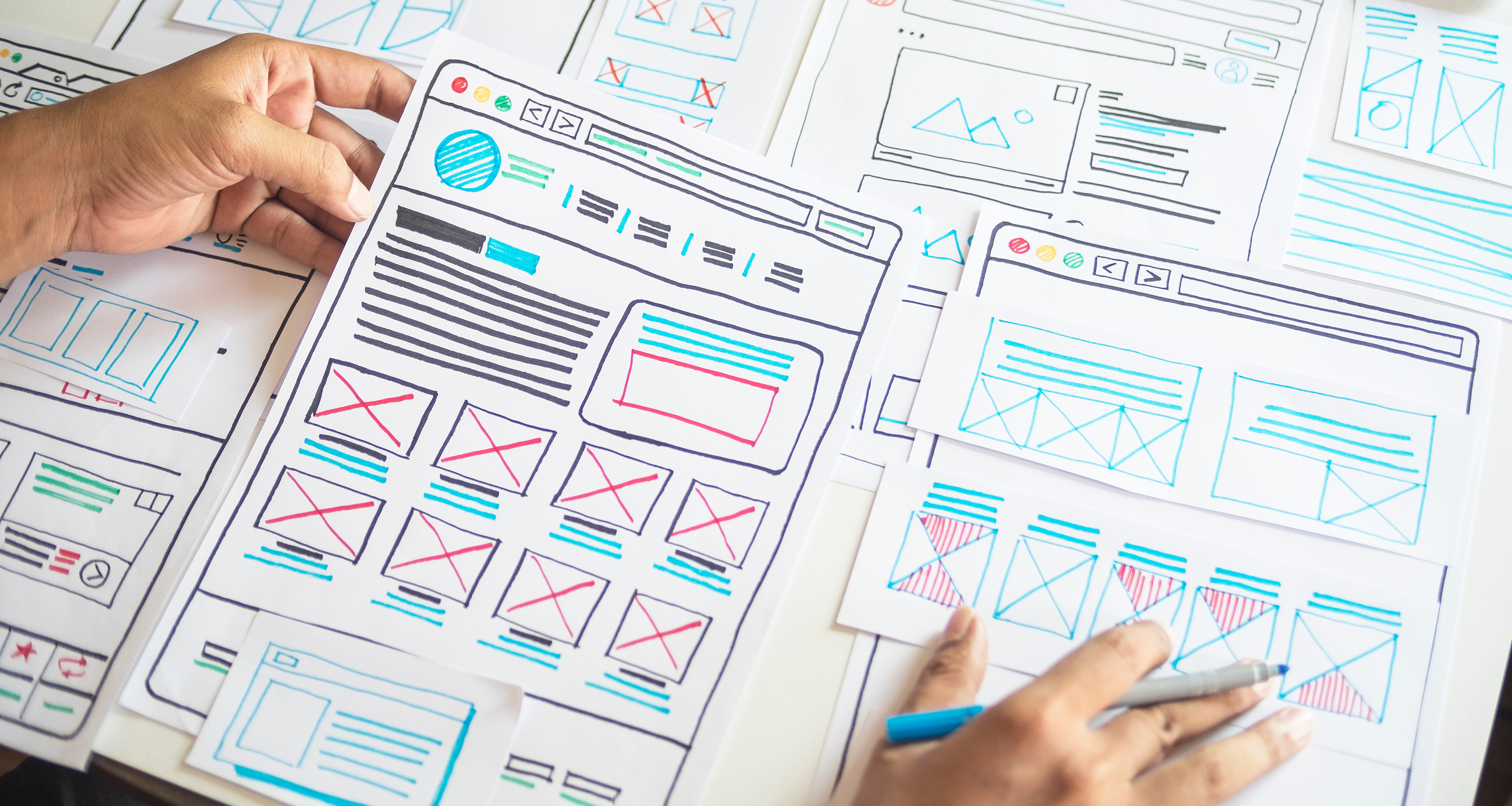
Paper Wireframes
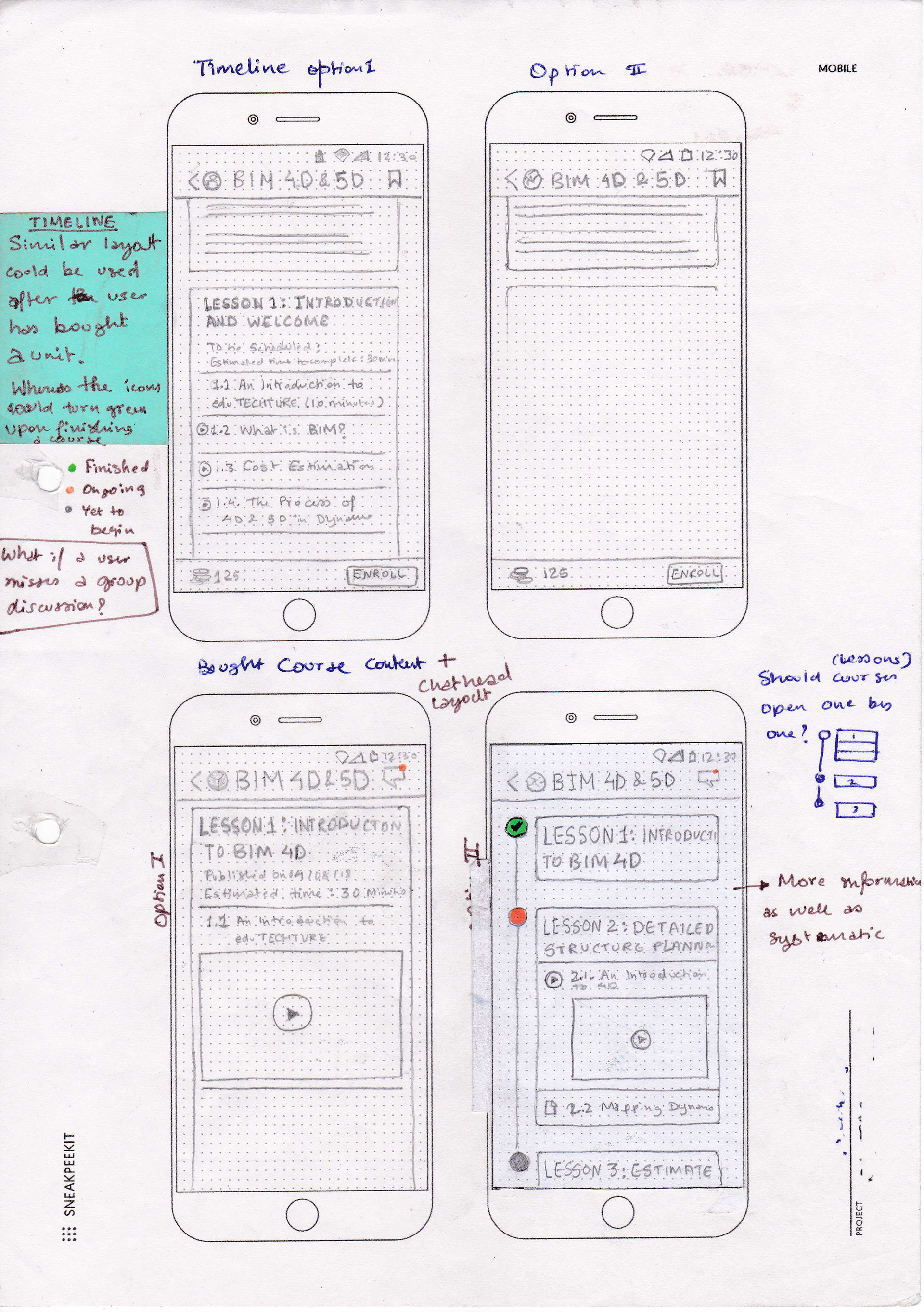
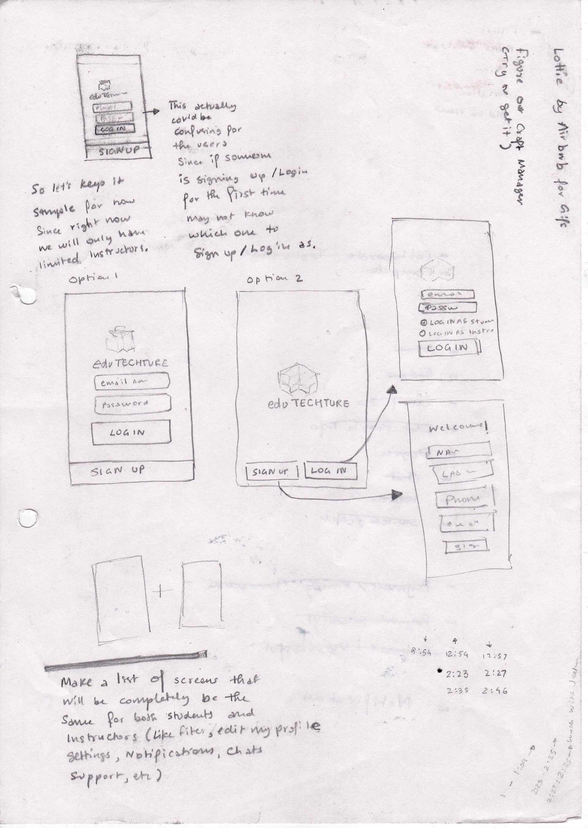
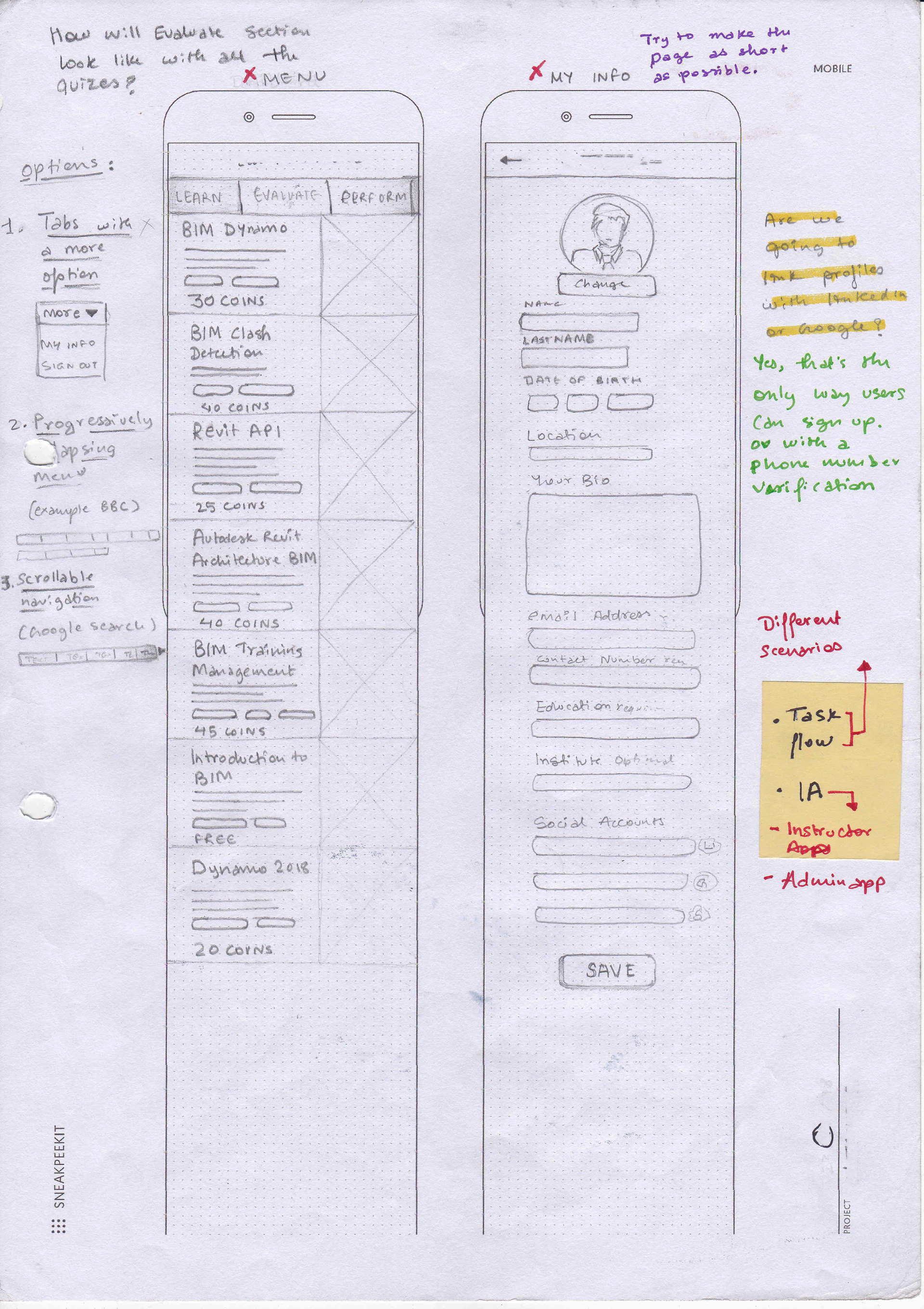
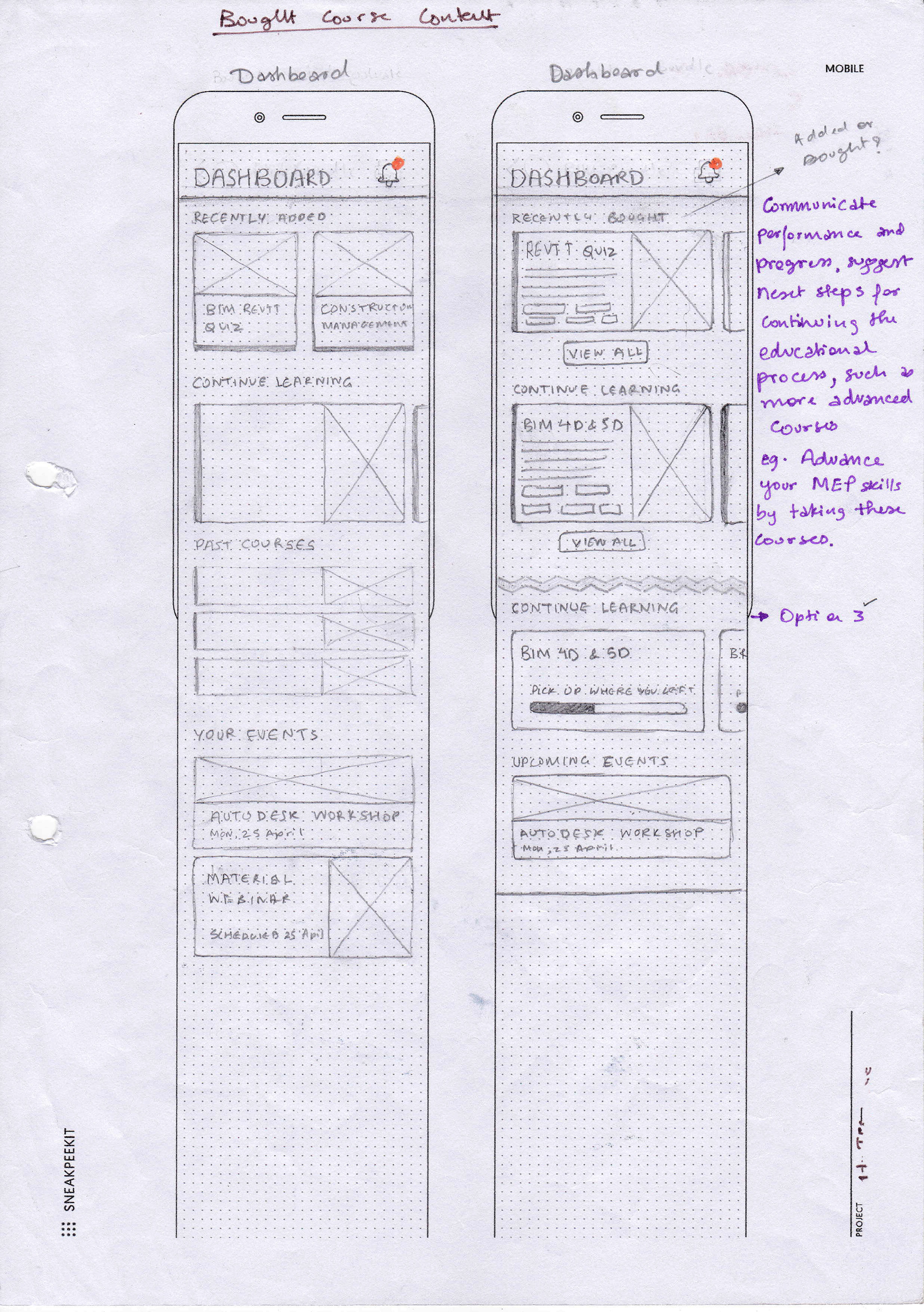
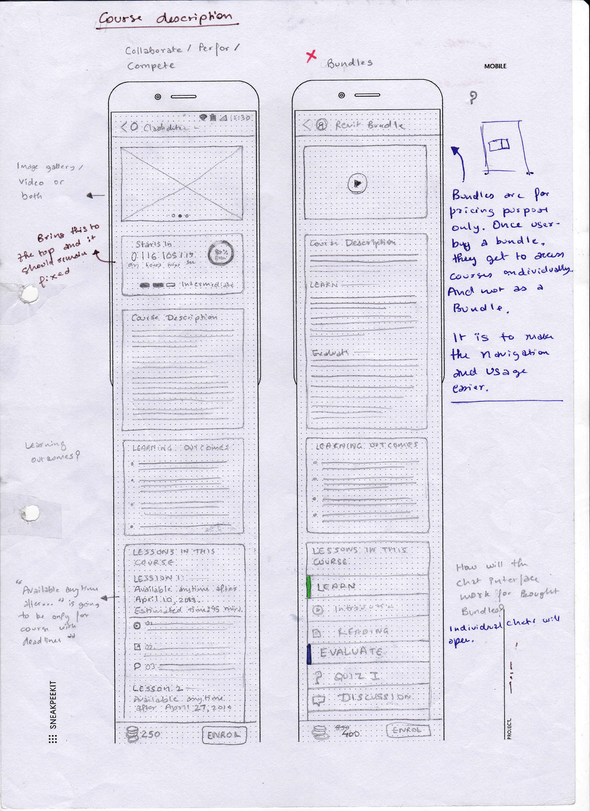
At the start of this e-learning app project, I relied on paper wireframes as a fast, flexible way to explore and iterate on ideas. Sketching by hand kept the process fluid and low-stakes, letting me experiment with different layouts and flows without getting bogged down in details. This quick, no-frills approach meant I could refine or scrap concepts on the fly, ensuring I had a solid direction before moving on to polished digital designs.
Paper wireframes also proved invaluable for their quick turnaround especially, in a collaborative environment. Our developers and engineers were actively involved during this stage, allowing us to surface feasibility questions early and resolve them in real time. This not only saved time down the line but helped align design intent with technical constraints from the outset.
Check out my Medium post as to why I used paper wireframes over Figma.
To comply with the non-disclosure agreement, I have omitted most part of the final outcomes I worked on due to the confidential nature. Full case study is available on request.